
SWOLTIME
Designing the Full Workout Experience
Research
Synthesis
Design
Inventory Analysis
Comparative Analysis
Heuristics Analysis
User Interviews
Affinity Mapping
User Persona
Problem Statement
Sketches
Lo-Fi Wireframes
Hi-Fi Wireframes
Prototyping
My Roles
UX Designer/Researcher
Timeline
3 weeks, April of 2025
Tools
Figma, Zoom, Slack, Toggl
My Tasks:
User interviews, Usability Testing of the original app, sketching, affinity and journey mapping, lo-fi wireframes
What is Swoltime?
In this collaborative project, our UX team partnered directly with the founder of Swoltime LLC to enhance and expand their fitness app, SwolTime, into a full-fledged workout experience. Originally developed over the past five years, the app primarily functioned as a versatile workout timer—supporting weightlifting, HIIT, mobility, stretching, running, and boxing. Our goal was to build on this foundation and design a more holistic and user-centric fitness experience.

Existing Pain Points
-
Confusing Timer Options
-
Friction in workout planning and custom exercise creation
-
Lack of Exercise Suggestions
-
Not All Exercises Need Timing
-
No On-the-Go Plan Building
-
No Rep/Weight Tracking
-
Lack of Useful Analytics
-
Workout Plan Doesn't Save Edits
Product Goals
Design Principles
-
Keep it Simple: Minimal distractions, minimal buttons, maximum efficiency.
-
Compact: navigation is a major tax. Our focus is to keep the user within 3 clicks of any major action.
-
Flexible: adaptable enough to fit all on-the-go workout scenarios
The Brief

THE WARM UP
USER RESEARCH
What's In the Gym Bag?
Taking stock of Swoltime's Current Features in an Inventory Analysis
To take SwolTime to the next level, our first step was to conduct an in-depth inventory analysis of the existing app. We evaluated its current features and functionality, then benchmarked them against top-performing fitness apps that seamlessly integrate workout timers into a complete fitness experience—whether as a core feature or an optional enhancement. Those competitors were Shred, Hevy, and Seconds.
Figure 1-1: Comparative inventory analysis of SwolTime alongside competitor workout apps—Seconds, Shred, and HEVY—highlighting key feature similarities and gaps.

Who's Setting the Pace?
How Other Fitness Apps Stack Up — and Where Swoltime Can Flex Harder
Once we identified our inspirations, I conducted a competitive analysis to dive deeper into the end-to-end user flows of each app. This helped us uncover key enhancements we could aspire to—while still staying within the project’s scope.
Figure 1-2: In-depth competitive analysis of the workout apps Shred, Seconds, and HEVY, evaluating strengths, weaknesses, and opportunities across core features and user experience.
Shred
-
Wide range of workouts from gym based to bodyweight exercises, HIIT, free weight etc, cardio etc.
-
Different fitness levels and preferences.
-
Progress and insight tracker
-
Different styles of AI driven coaching
-
18 different training styles.
-
Inter working timer used for HIIT exercises
Seconds
-
Straight forward interface to create and customize workout routines
-
Easy to read display
-
Custom Exercise Creation
-
Progress Tracking
-
Audible Alerts
-
Can run in the background if while you use other apps.
Hevy
-
Unlimited Routines and Exercises
-
Simple interface to construct workouts quickly
-
Advanced Routine Planner and workout logging.
-
Automatic Rest Timers
-
Intuitive workout log that recalls weights and reps from previous workout.
-
Progress tracking dashboard
-
Muscle distribution charts
Stretching Usability Muscles
Evaluating Swoltime’s Usability with Heuristic Analysis
1. Recognition rather than recall-Make objects, actions, and options visible to help users rely less on memory.


2. Flexibility and efficiency of use- Allow users to adjust frequent actions to fit their needs


Listening Before Lifting
Conversations with Users
I conducted 3 of the 8 user interviews, speaking with individuals from diverse backgrounds — including those not currently working out, active users tracking their fitness, and even professional trainers. Even within the first few conversations, clear patterns began to emerge. Some key takeaways included:
I want to see how I improve over time.
-
“I keep my goals in front of me by using charts.”
-
“I get more motivated as I see results, either physically or in a graph.”
I have time constraints.
-
“Time is limited. I have to decide what I’m focusing on.”
-
“I never want to be in the gym for more than an hour.”
I like to be able to adjust my workouts as I go.
-
“I have to adjust my workout based on what machines are available.”
-
“I love that I can move my workouts around in the app that I use.”

INSIGHT GAINS
Our Discoveries from Synthesis
Mind Gains
Synthesizing Insights with Affinity Mapping
As we took this feedback and started to synthesize, we started to see some other user needs align with the business needs especially when it came to workout routine creation and not just randomly selecting exercises, having workout analytics just a click away and providing workout milestones as a result of those analytics.
"I want to see how I improve over time."
"I want to keep my goals in front of me."
"I prefer to create my own workouts."
"I prefer to use a pre-made workout."
Running in Avery's Shoes
Creating our Persona.
At this stage, our core concepts were established and our persona could be solidified.

Avery B.
-
42 years old, has two children
-
Occupation is ER Nurse
-
Located in Denver, Colorado
Interests
-
Hiking, rock climbing, trail running, weekly gym visits.
-
Wants to prevent bone deterioration and continue doing physical activities with family.
-
Wants to play with/pick up her kids.Interests
Frustrations
-
Doesn’t have an efficient way to plan workouts.
-
Recently changed careers to become an ER nurse, now has a demanding schedule
-
Has noticed that it is more difficult than before to lift heavy weights (i.e. patient transfers)
Needs
-
Needs to be able to construct a new workout routine quickly, in 2 minutes or less
-
An easy way to retrieve info from previous workouts
-
To see progress over time
Problem Statement: Avery prioritizes her functional fitness, but she is also a busy mom and ER nurse and has many demands on her time. Avery needs a better way to plan and execute her workouts, while also keeping track of her progress over time.

FLEXING THE FLOW
Designing an Intuitive Workout Creation and Tracking Experience
Avery's Fitness Journey
Laying the Groundwork for End to End Flow.
There was a great deal of anticipation surrounding the initial design phase, particularly around how to effectively integrate the original timer with the new workout interface. The question we kept asking was what purpose does the timer serve when timing isn’t always necessary?
To explore this, we crafted a user story centered around Avery. She begins a workout that doesn’t require timing—allowing her to move at her own pace, completing each set and only using the timer for rest periods. However, the story pivots when Avery receives a call asking her to pick up her kids earlier than expected. Suddenly, her available workout time is cut short.
Instead of abandoning the workout, Avery adapts by switching her session from untimed sets to timed, high-intensity intervals. She now performs as many reps as possible within a minute—similar to a HIIT workout—enabling her to complete her workout efficiently and still make it in time to pick up her kids.
Figure 1-3: End-to-end user flow illustrating the full workout creation and completion process, from selecting exercises to marking a workout as finished.
Landing
Page
Create Workout
Exercise Library
Set Timer/workout parameters
Start Workout
Workout Completed/ Analytics page
Updated Timer & Exercise Sets
Toggle to timed sets
**Assumption: User has previously used SwolTime App, and is experienced in working out.
Form Before Function
Wireframes that Flex
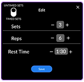
As we moved into low-fidelity sketching and wireframing, we hit two key roadblocks. The first was choosing the right terminology for Avery’s workout edit menu — specifically, when switching between timed and untimed sets. We explored options like “open set” and “closed set,” but many terms were already used in different contexts within the fitness industry, which risked confusing users. I proposed using “timed” and “untimed” for their clarity and neutrality — these terms had no strong fitness connotation and clearly described the intended timer behavior.
The second challenge was integrating the timer across all workout types, even for untimed routines — a key request from the client. Our solution was to allow the timer to count up during untimed sets, giving users a sense of how long they’d been working out without enforcing a time limit.
I drafted the early wireframes for the workout page, including an edit menu accessible via a swipe-up interaction. While this gesture added a layer of interactivity, we later opted for a more straightforward edit button to reduce visual clutter and better align with our feature-rich, intuitive design goals.
Figure 1-4a: First draft of a low-fidelity wireframe featuring a swipe-up menu to edit the workout.


Figure 1-4b: High-fidelity wireframe with an updated design that replaces the swipe-up menu with a dedicated edit button, while preserving the original toggle functionality.

We were able to simplify navigation and streamline the workout customization by keeping the entire exercise library to one page. The use of a drop down menu at the top helps Avery filter by muscle type. The filtered list below allows her to populate the exercise at the top of the menu so that she can keep track of what she's adding as she searches.
One thing we needed to change about the library was the display of workouts and changing from a gallery view to a list view. This gave us more real estate to add longer names like "weighted lunges" or "inverted rows".
Figure 1-5a: Mid-fidelity wireframes showing the full exercise library and a filtered view that relies solely on imagery to represent workouts.


Figure 1-5b: High-fidelity wireframe that combines imagery and text to enhance clarity and support better recall of each exercise.


Upon completion of the workout Avery comes to her workout analytics page. This not only tracks progress long term but also gives more insight (i.e. personal records).
In our earlier wireframes we had the analytics page as a possible landing page with a "start quick timer" button as the first actionable item. This made it so that Avery could jump right into a workout on the fly if she wanted to. However, this overshadowed any prompts for Avery to create a workout, which minimized productivity in the app. To correct this, we created a new landing page that kept all actionable items at the top, and then repurposed the analytics page as a more insightful post-workout page.
Figure 1-6a: A mid-fidelity wireframe displaying workout analytics on the landing page, with a "start quick timer" positioned below.

Figure 1-6b: High-fidelity wireframes reposition the quick timer to the top alongside a "Create Routine" button for a stronger call to action. Users can now choose between saved routines and previously completed workouts, while the analytics page has been moved to appear post-workout, aligning with the natural flow of user engagement.


The Cooldown
Conclusion
We were able to attain the following product goals:
-
Simplify navigation
-
Streamline workout plan creation and customization
-
Establish a flexible, feature-rich single page in-workout experience
-
Provide visual analytics and progress insights
with the following design principles:
-
Keep it Simple: Minimal distractions, minimal buttons, maximum efficiency.
-
Compact: navigation is a major tax. Our focus is to keep the user within 3 clicks of any major action.
-
Flexible: adaptable enough to fit all on-the-go workout scenarios
While success metrics for SwolTime were discussed early in the project, my involvement concluded before our designs were implemented in the live app. As of June 16, 2025, the designs have not yet been developed, and I have not had the opportunity to follow up with the stakeholder regarding their potential impact. I look forward to revisiting this in the future once the product is built and in use.
Key Takeaways:
-
Dynamic Page Design: We discovered how to make a single page—specifically the workout page—adapt to multiple workout styles by modifying just one key element. This approach streamlined development while maintaining a cohesive user experience.
-
Intentional Layout Planning: We learned the importance of proactively planning for space allocation between typography and imagery when designing content-rich pages like the workout library. This ensured visual balance and readability across different devices and screen sizes.
Figure 1-7: Final walkthrough of the end-to-end prototype, showcasing the full user journey from workout creation to completion, concluding with post-workout analytics.
