
What's Your Ride?
An independent project focused on redesigning the website of Florida E-Bikes, a storefront located in Sarasota, FL.
Role: UX/UI Designer and Researcher
Tools: Figma, Zoom,
Timeline: 3.5 weeks, April 2025
Research
Synthesis
User Interviews
Usability Tests
Comparative Analysis
Card Sorting
Affinity Mapping
Site Mapping
Design
Sketches
Lo-Fi Wireframes
Hi-Fi Wireframes

Pedaling Through the Unknown
User Interviews
To make the most of the 3.5-week timeframe, I started with four user interviews that allowed me to understand how users shop for e-bikes, what features are most important to them, what online resources they rely on, and which areas of the website needed the most improvement.
I found a mom and pop shop in Canada that had really good organic reviews. They shipped it to me since I didn’t have th right car for pickup.
For a traditional biker it’s a totally different experience. I at first thought it was better for people who were a bit lazy.
I researched with youtube for user tested reviews since I don’t know anyone with e-bikes to give me a testimonial.
Tire tread is a big focus for me, and then I looked at Foldable vs non-foldable. Battery Consumption. Weight.
I used a lot of ebike forums like ones on reddit. Googled and used amazon.
Occasionally I go through city traffic so I throttle up to 25 miles an hour and stay with flow if the traffic is tight.
Biggest questions I had: Tire tread is a big one. Foldable vs non-foldable. Battery Consumption. Weight.
I like it for the office and for downtown because it allows me to scoot around more quickly than I otherwise would.

Charging Up with User Insights
Usability of the Original Website
After getting a good feel for how users research and make buying decisions, I moved on to a usability test of the current Florida E Bikes site. This helped me spot which parts of the site were falling short and where users needed a better experience.
The first point of criticism was the layout of the top navigation bar and how there was a lot of redundancy in shopping categories between "electric bikes" to "shop online". There was also some concern about how other menu options like "electric bike sales" took the user to a page with information they would not have expected.


People also mentioned the site felt clunky and outdated, with banners that gave off serious “amber alert” vibes—not exactly inviting. Clickable brand logos would scroll across the screen automatically, which ended up being more distracting than helpful. On top of that, the search results weren’t consistent—depending on how users got to a page, some inventory wouldn’t even show up.
Figure 3-1: Redundant and misplaced shopping sub categories in two different top menu options of the original website
Figure 3-2: Outdated aesthetics and distracting animations between the homepage and the product listing page.

Pedal-Powered Prototypes
Design Overview
Once I had a clear understanding of each persona’s frustrations, I was able to lay a solid foundation for several redesigned web pages. The goal was to simplify navigation and better consolidate content across pages like the product listing and product description, making it easier for Bastien and Mimi to quickly find the information they needed.
Figure 3-3: Low fidelity to high fidelity wireframes of the redesigned homepage, listing page, and product description page.


Mapping the Ride Before the Road
Site Map and Task Flow
To make the e-bike buying experience as smooth and enjoyable as possible, I designed a site map to make sure results and inventory were consistent no matter how they explored the site. With a limited inventory, I skipped the clutter—keeping filters and dropdowns to a minimum so the experience stayed simple, clean, and focused on what mattered. Webpage templates for product listing and description pages would be identical for bikes and accessories.


The task flow was also kept simple—focused mainly on helping users search for an e-bike and move smoothly through to purchase. No extra steps, just a clear path from interest to ownership.

Riding in Their Shoes
Affinity Mapping and Persona
With a clear understanding of which areas needed improvement, I shifted focus to what could be added to enhance the overall buying experience. I created an affinity map using a series of 'I Statements' that captured key user needs and behaviors. From these insights, two user personas emerged, each representing distinct goals and pain points in the e-bike shopping journey.
"I use my e-bike for quick simple travel."
"I don't know a lot of people with e-bikes."
"I was concerned about the weight of my e-bike."
"I use my e-bike in busy urban areas."
"I did my research through social media/online forum"
"I was concerned about battery life."
"I had questions about different specs of the e-bike."
"I would tell a novice e-biker to focus on what features matter most."
"I was concerned about the speed of the bike."
From there, I created two distinct personas—one a busy dad juggling family and a commute, the other a more traditional biker and retiree looking for a reliable ride.


Problem
Statement:
Bastien needs a better way to research and collect reliable testimonials to find the right ebike that is efficient for his commute and school runs for his kids.
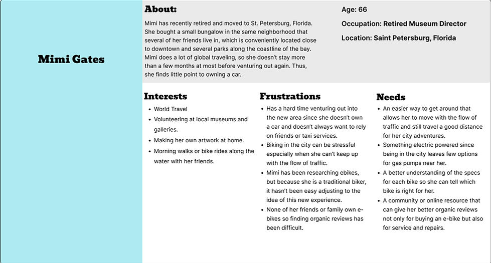

Problem
Statement:
Mimi needs a resource that provides a simplified list of specs for an ebike that can keep her moving with the flow of traffic in a busy urban area, and still provide her with an extensive battery life for longer rides.
Charging Up the First Impression
Updating the Landing Page
My approach to the homepage was to replace the pixelated imagery and remove distracting media and minimize clutter, making the focus squarely on the shopping experience. Features like videos, testimonials, and news updates were repurposed for dedicated pages better suited for research or community engagement around e-bikes. The second priority was to update the pixelated imagery at the top.
Figure 3-4: A comparison of the original landing page to the redesigned landing page.
Before
After

Lining Up the Ride That Fits
Updating the Product Listing Page
The original product listing page could only be accessed by the top navigation bar and a long list in a side bar that displayed every category in accessories and e-bikes. This made the experience clunky with more information to sort through. The redesigned version provided the top navigation throughout and a side bar with categories more specific to the e-bike listing page and the accessory listing page. Inventory was also displayed in scrollable galleries to minimize real estate.
Figure 3-5: A comparison of the original product listing page to the redesigned product listing page.
Before
After

Gearing Up the Specs
Enhancing the Product Description Page
The original product description pages had specs scattered across the layout with poor categorization, making it hard to digest. I addressed this by using simple dropdown menus to organize information by subject. While many pages only featured a single testimonial, I made sure to include space for more in the redesign. I also repurposed video content by embedding third-party YouTube reviews tailored to each e-bike—helpful for Bastien, who values multiple sources, and for Mimi, who prefers specs grouped in a clear, structured way.
Figure 3-5: A comparison of the original product description page to the redesigned product description page.
Before

After

Honorable Mentions
One page I'd love to develop in the future for this type of project is a community hub—something like a blog or forum, inspired by some of the examples below. This would give users like Mimi and Bastien access to helpful, unbiased content like e-bike reviews, news, and tips. Some competitors I analyzed even host in-person events and offer reward systems, which could be great features to explore down the line.
Figure 3-6: Early inspirations of a blog and community page provided by Pedego Electric Bikes in Sarasota, FL.


In Conclusion
I thoroughly enjoyed researching and designing for this project as it explored some technical changes to create a better online shopping experience at Floridaebikes.com. I was surprised to discover how much of a need there was to include a sense of community and giving users the opportunity to connect with other users to validate their buying behavior and guide them through the process of finding the right e-bike.